If you want to teach people how to deal with cybersecurity threats effectively, you need a rich content foundation. Most attackers usually try to imitate popular and existing brands, as that is the easiest way to trick people and get the required sensitive information into their hands. At Pistachio our goal is to produce content close to the real threats so we can guide our customers safely through the clues to help them spot fraud and feel safe in the real world. We therefore use real brands in some of our phishing simulations, as we want people to be prepared.
However, utilizing real brands also comes with challenges. We don’t want to cause genuine confusion in the minds of our customers, and we don’t want our phishing simulations to get in the way of legitimate businesses’ operations. We therefore want to use real brands only as much as is actually needed.
That led us to realize that we need to create great-looking, timeless, and trustworthy fake brands to appear in our simulations. We needed fake brands that looked and felt real so that we could simulate threats without always relying on the real thing. This blog post is about how we approached that task.
Design Challenges
The main challenge for any product team is time. Designing a good brand takes time, and suddenly we needed to make 40 or more brands in just a matter of weeks. The developers had a good setup for building the content, so the brand design work really was a bottleneck.
On top of that, we needed to create a seamless handoff process. The developers needed to be able to quickly access brand assets for all of the fake brands we made, and understand how to build content that matched our vision.
Behind the Scenes
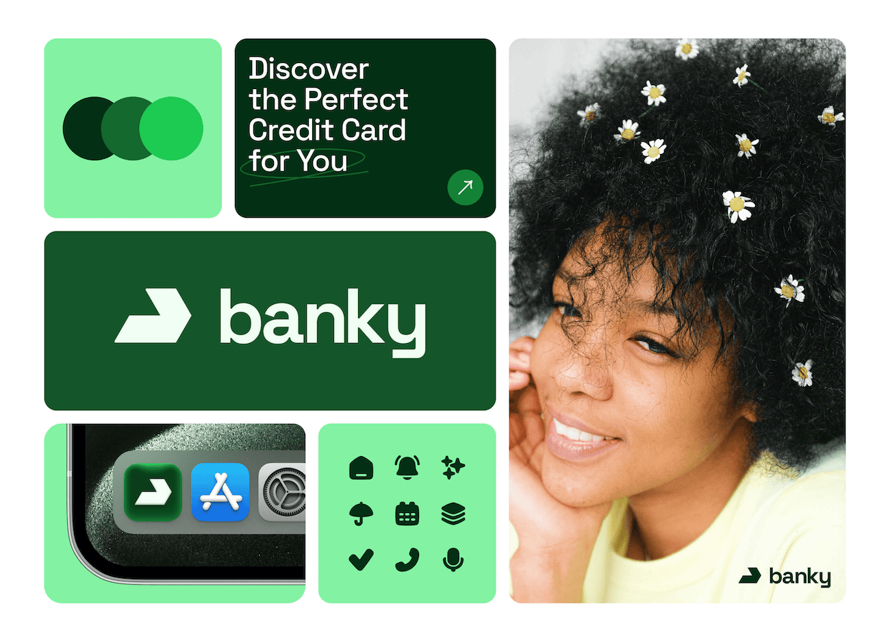
Fonts. Every brand should have its own font family to represent its identity in a unique, proprietary way. To achieve that, we decided to limit ourselves to Google Fonts. These fonts are easy to connect to a project, and because they are free we could use them right away at no cost. So, we sadly had to say goodbye to the fancy type foundries we would have loved to use.
Colors. Our development team uses Tailwind, which made it easy for us to use a color tool named UI Colors. That tool creates a color scale of 11 shades based on a primary color you picked, while also providing a preview of how the UI could appear using that palette. That allowed us to create color schemes quickly and easily.
No AI-generated graphics, please. There are already so many logomarks generated by MidJourney, Stable Diffusion, and other AI models. Instead of looking like everyone else, we wanted to try making the logo ourselves. I will admit that this was partly for fun. As a designer, it isn’t that often that you get to go back to your roots and land your first logo, and so it was great getting to do it so many times. It also was nice because there were no stakeholders to please; I could play the role of the CEO, CTO, and designer when making these logos. But beyond that, Pistachio is about people, so giving these fake logos a human touch felt consistent with our brand.
To help us get started we used Cool Shapes, which is an open-source library with 100+ vector shapes. However, we made major changes to the vectors and ultimately ended up with something totally different and unique for each brand.
Style guide. We had to make each brand come in three variations: dark, light, and colored. Next to each logo we created a style guide that includes the font family, color palette, and examples of how to use the brand. For the examples, we modified basic UI elements like input fields, buttons, and paragraphs of text and styled them according to the brand. This helped provide the developers with more context for how the brand should look and feel, and made it easy to create new content with such a limited foundation. That also meant we didn’t need to make a detailed Figma design for each new email and brand.
Naming. I mentioned that we don’t want to rely on AI, but for naming we made an exception. We used ChatGPT to generate dozens of potential names for each brand, and we then used that as a launching point to start exploring new names.
We’re Just Getting Started
We ended up with 45 different brands, complete with a name, logo, font, color scheme, and style guide. These brands cover a wide variety of business niches, and can be used to produce a range of different attacks. And because we applied a consistent approach to creating and documenting each brand, we did the entire thing in two weeks.
I will admit that this was a fun task. I enjoyed exploring new visual styles without the usual limitations that a branding job imposes. But what really matters is what happens next. As we use these brands in our attack simulations we will be monitoring the results, and we will make adjustments as we go. And, if there’s anything interesting, we will be sure to write another post about the changes we made.